Interview with Roberto Gamonal
Kelcey Gray
If there were such a thing as typographic pen pals, Roberto Gamonal and I would be prime examples.
What started with an online order question has led to a continued long-distance conversation between two type-lovers brought together by a mutual love for Spanish Civil War typography. Curious about his work and his involvement in Santo Tipo, I sent Roberto, a Madrid-based designer and letterpress printer, a few questions; his answers below in both Spanish and English.
ESPAÑOL
Háblame de ti, de tu práctica de diseño y de la tipografía familiar Plómez.
Soy profesor de Diseño, Edición y Tipografía en la Universidad Complutense de Madrid y soy diseñador editorial. Estoy especializado en diseño de publicaciones. Así que mi principal materia prima es la tipografía.
Me gustan las letras por su forma y por su contenido. Las letras del alfabeto me parecen el dibujo más perfecto que jamás ha hecho el ser humano.
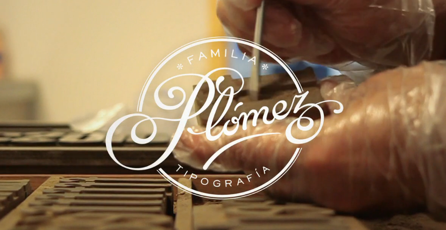
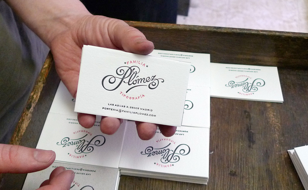
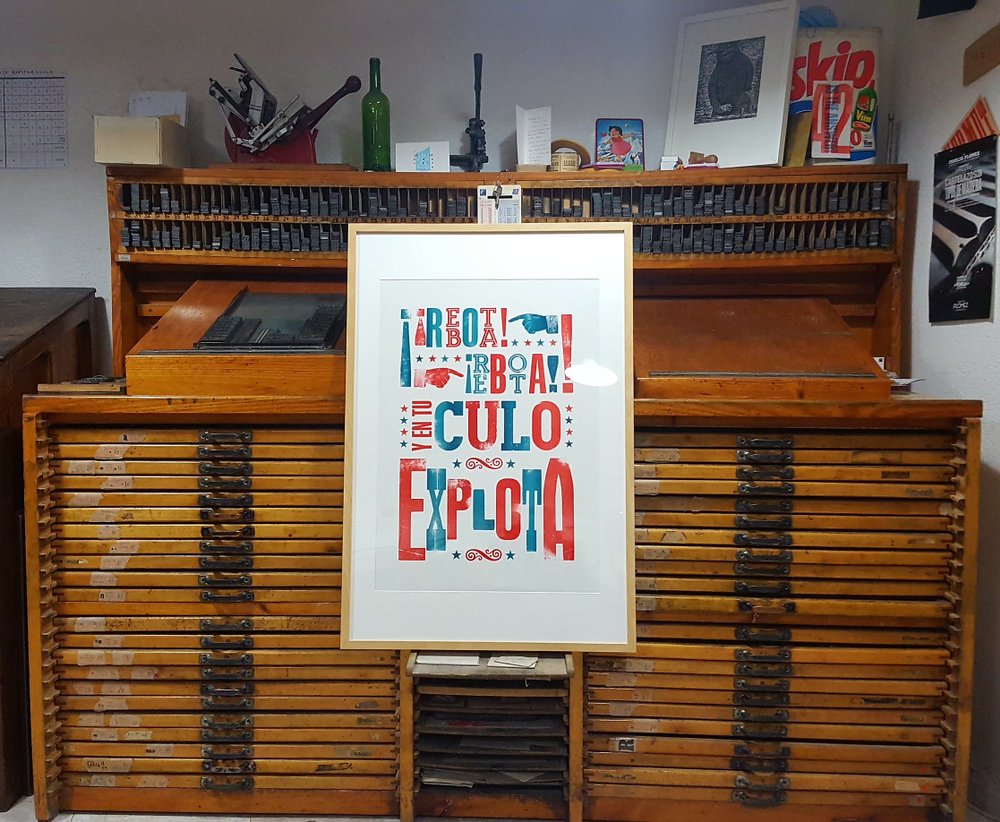
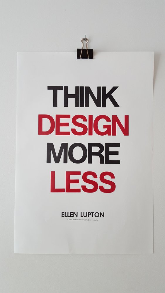
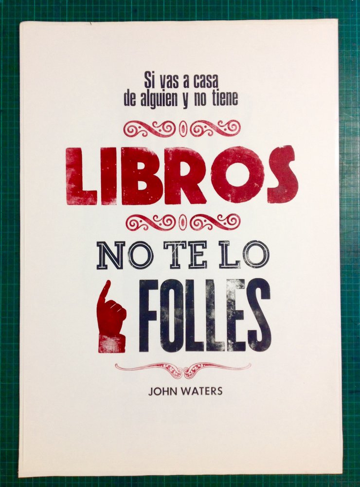
También formo parte de Familia Plómez, una asociación cultural cuyo objetivo es preservar las técnicas de composición e impresión artesanales con tipos móviles. Tenemos un taller de imprenta donde damos un uso actualizado de un material antiguo rescatado de viejas imprentas. Principalmente producimos carteles porque es el formato más expresivo para potenciar el poder visual de la tipografía.
ENGLISH
Tell me about yourself, your design practice and La Familia Plomez.
I am a professor of design, publishing, and typography and the University Complutense of Madrid, and I am an editorial designer. I specialize in the design of publications. So, my primary material is typography.
I like letters for their form and their meaning. Letters of the alphabet seem to me to be the most perfect drawing ever made by a man.
Also, I form part of Familia Plomez, a cultural association whose objective is to preserves the artisan composition and printing techniques of movable type. We have a printing workshop where we provide an up-to-date use of old material rescued from old printing presses. We primarily produce posters because it’s the most expressive format to show the visual power of typography.
How and when did you get into Letterpress?
I began to letterpress from a didactic perspective. To work with movable type is the best way to learn about current typography. To compose text with lead type helps you learn concepts that ordinarily happen inadvertently like, white space, line, and paragraphs. Touching it and being able to see it in a physical and analogical format makes these abstract ideas better understood.
From where you do draw inspiration for letterpress?
From music, books, conversations with my friends, other designers, posters, signs I see on the street… I always walk looking up watching signs and one day I'm going to hit a street lamp. :)
Cómo y cuándo empezaste letterpress?
Mi acercamiento al letterpress fue desde una perspectiva didáctica. Trabajar con los tipos móviles me parece la mejor manera de entender la tipografía actual. Componer un texto con tipos de plomo te ayuda a entender conceptos que en el ordenador pasan inadvertidos como el espacio en blanco, la línea o el párrafo. Tocarlo y poder verlo en un formato físico y analógico hace que estas ideas abstractas se entiendan mejor.
De dónde sacas inspiración para letterpress?
Pues de la música, de los libros, de conversaciones con amigos, de otros diseñadores, de los carteles y los rótulos que veo por la calle... Siempre paseo mirando hacia arriba viendo letreros y un día me voy a chocar con una farola :)
SANTO TIPO
What is Santo Tipo? How did you become involved?
Santo Tipo es the Typography Week of Santo Domingo. A conference in which typography, calligraphy and lettering are strengthened, as well as editorial design. This is realized in the form of conferences, workshops and debate panels. It allows an exchange of knowledge and experiences in addition to showcasing really interesting work being done by Dominican designers.
The idea began as a joint proposal with a former Dominican student who studied with us, obtaining a master's degree in Editorial Design in Madrid: Marova (https://www.instagram.com/marovita/). Thanks to the support of the Cultural Center of Spain in Santo Domingo, we were able to put this exciting project underway.
Que es Santo Tipo? ¿Cómo te involucraste?
Santo Tipo es la Semana Tipográfica de Santo Domingo. Un encuentro en el que se potencia la tipografía, la caligrafía y el lettering, además del diseño editorial. Se realizan conferencias, talleres, mesas de debate y exposiciones. Permite un intercambiar de conocimientos y experiencias además de conocer trabajos muy interesantes que están realizando los diseñadores dominicanos.
La idea nació de una propuesta conjunta con una antigua alumna dominicana que estudió con nosotros un máster de Diseño Editorial en Madrid: Marova (https://www.instagram.com/marovita/). Gracias al apoyo del Centro Cultural de España en Santo Domingo pudimos poner en marcha este proyecto tan ilusionante.

Marova, at center, teaching a lettering workshop for Fun Packed Moments. Image Courtesy: Fun Packed Moments http://shopfpm.com/acerca-de-fun-packed-moments/
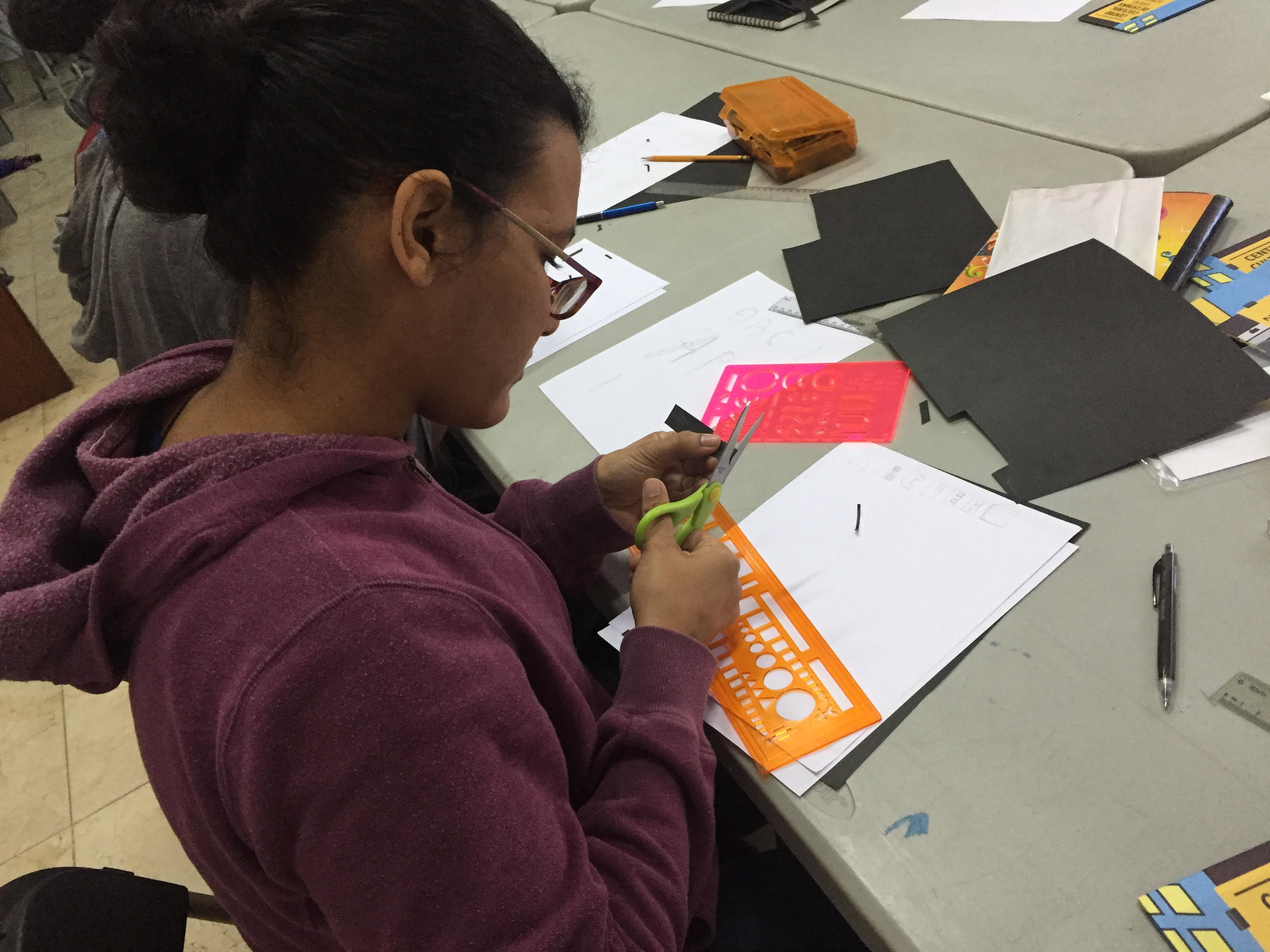
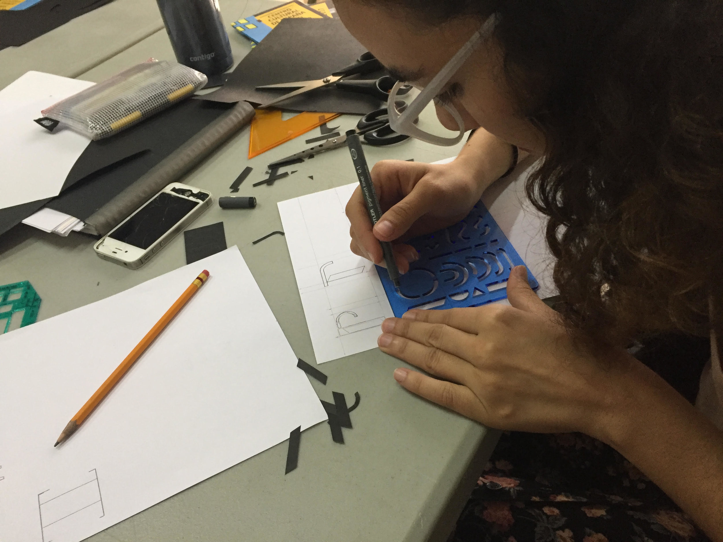
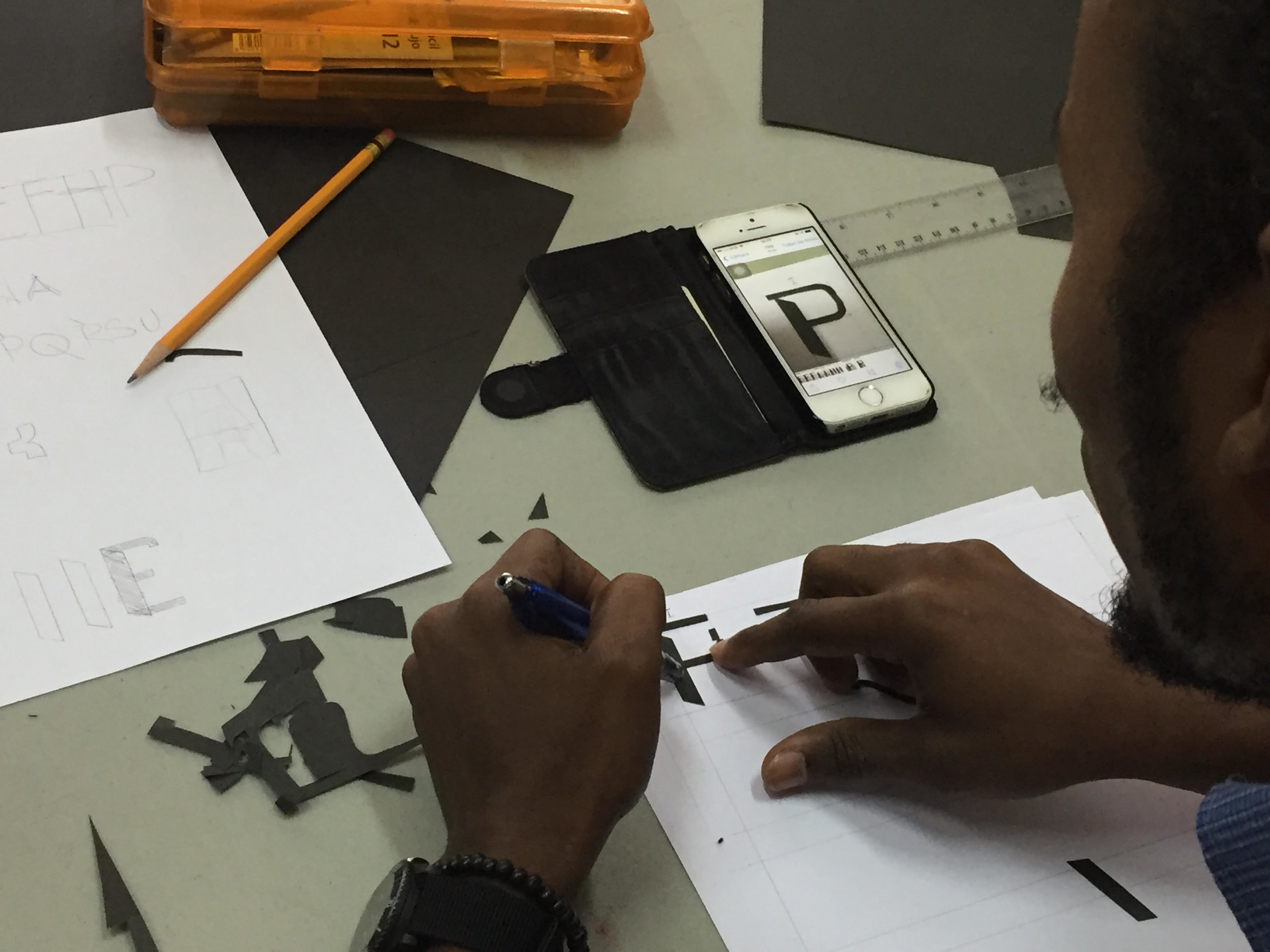
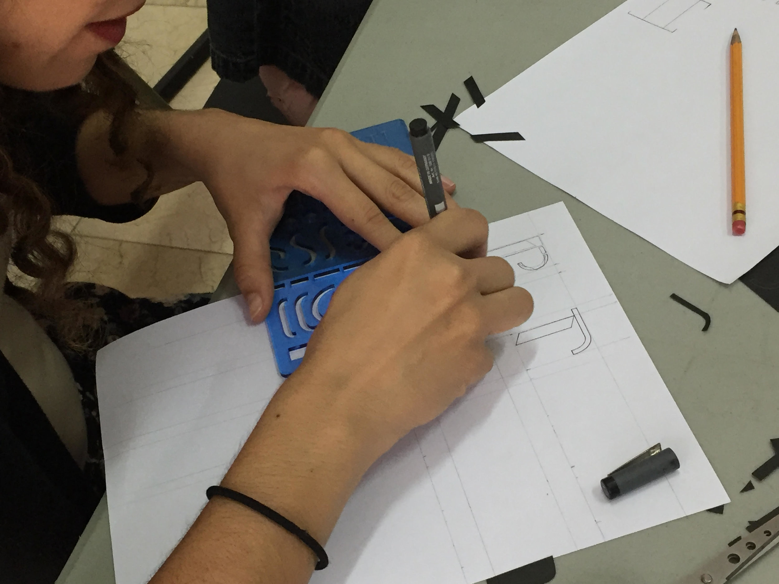
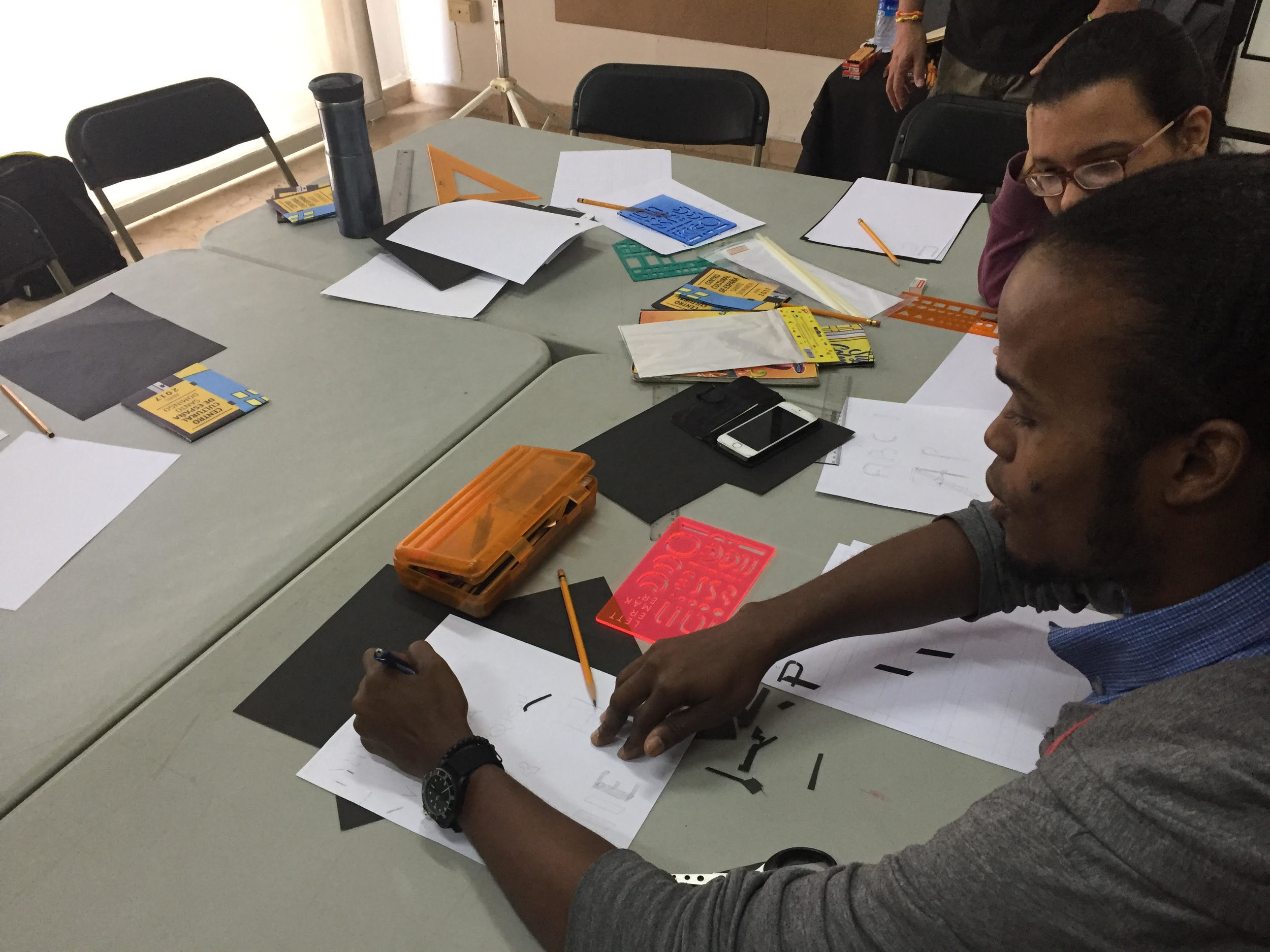
Talk to me about your stencil workshop. Why do you think stencils are a good way to create letterforms?
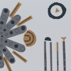
One of the workshops that we proposed for Santo Tipo was a small introductory course on the construction of the letter. It was an approach to sketch letters in an analog form and it was addressed from two points of view: the module and the stroke. Working with the module, I thought that the most useful tools would be to use stencils as a limited and predefined form. I allowed for the creation of an alphabetic system with few elements, but these elements can be combined almost infinitely and you can create multiple forms.
What other tools and methods do you use when creating letters?
I prefer analog tools to pixel and vectors: Wood and lead type, calligraphy pens, pencils, pens, felt pens. I love ink.
How can designers of the world get involved with Santo Tipo 2018?
We still do not know how we are going to make the follow-up edition or which guests are going to participate. But, we do want to publicize it on social networks with contributions from other designers with the words "Santo Type" made with any technique and/or tool.
Háblame del taller de plantillas. ¿Por qué elige plantillas para crear formas letras?
Uno de los talleres que se propusieron en Santo Tipo fue un pequeño curso de Introducción a la construcción de la letra. Se trataba de un acercamiento al boceto de letras de forma analógica y se abordaba desde dos puntos de vista: el módulo y el trazo. Para trabajar el módulo, me pareció que la herramienta más útil era usar plantillas con formas limitadas y predefinidas. Esto permite crear un sistema alfabético con pocos elementos, pero estos elementos se combinan de forma casi infinita y puedes crear múltiples formas.
¿Qué otras herramientas o metodos usas cuando creas letras?
Prefiero las herramientas análogicas al pixel y al vector: tipos de madera y de plomo, plumas caligráficas, lapiceros, bolígrafos, rotuladores. Me gusta la tinta.
¿Cómo disenadores del mundo pueden involucrarse en Santo Tipo 2018?
Aún no sabemos cómo vamos a hacer la siguiente edición ni qué invitados van a participar. Queremos publicar en las redes sociales las aportaciones de otros diseñadores con las palabras "Santo Tipo" realizadas con cualquier técnica y herramienta.
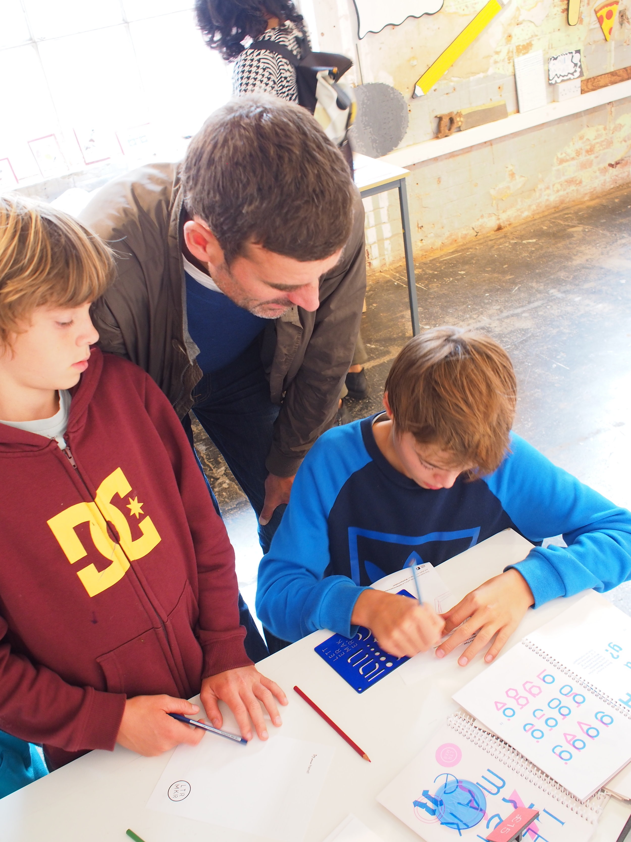
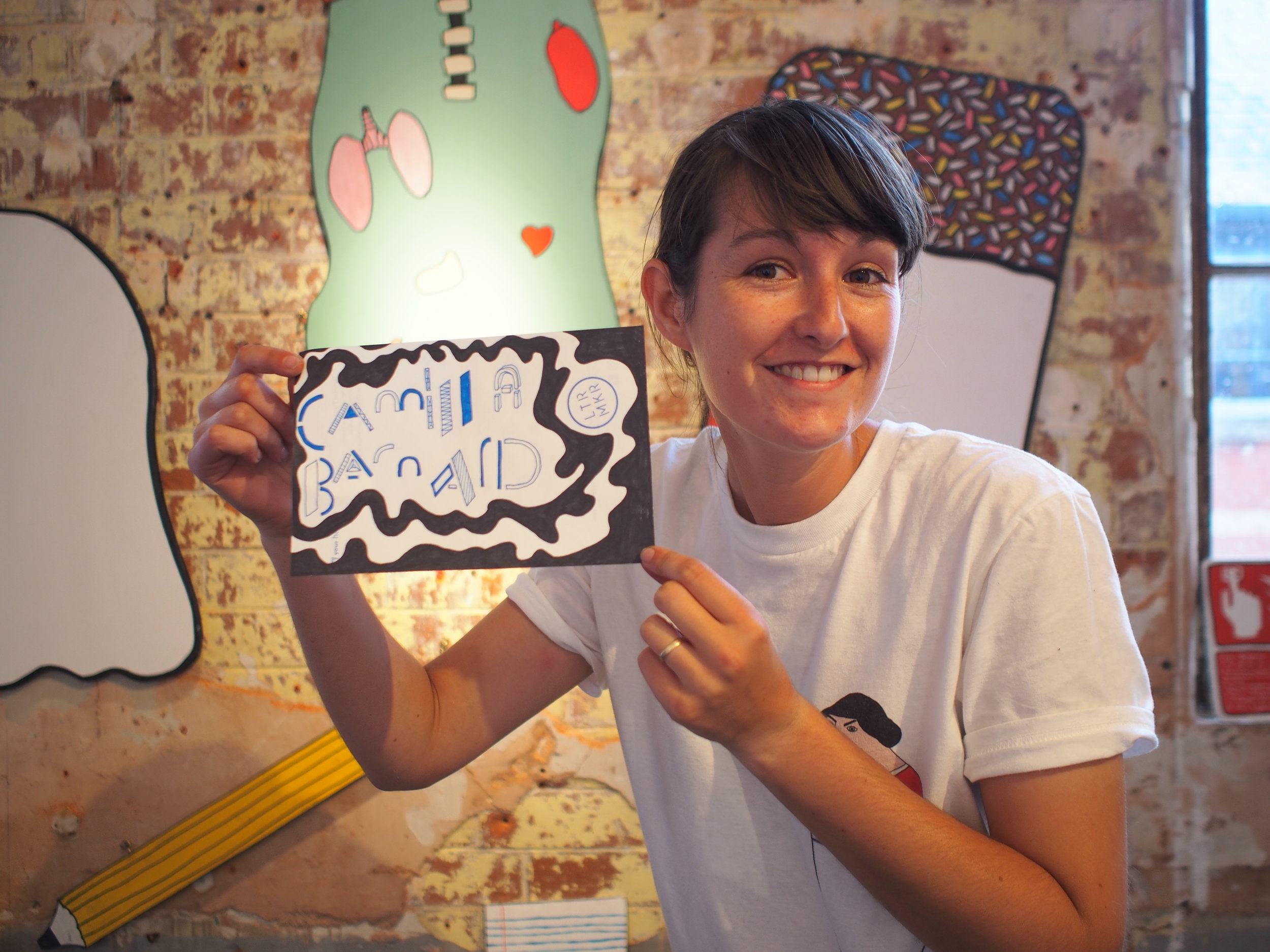
Below, conference goers use LetterMaker and other stencils to create their own unique alphabets.
SUPER TIPO VELOZ


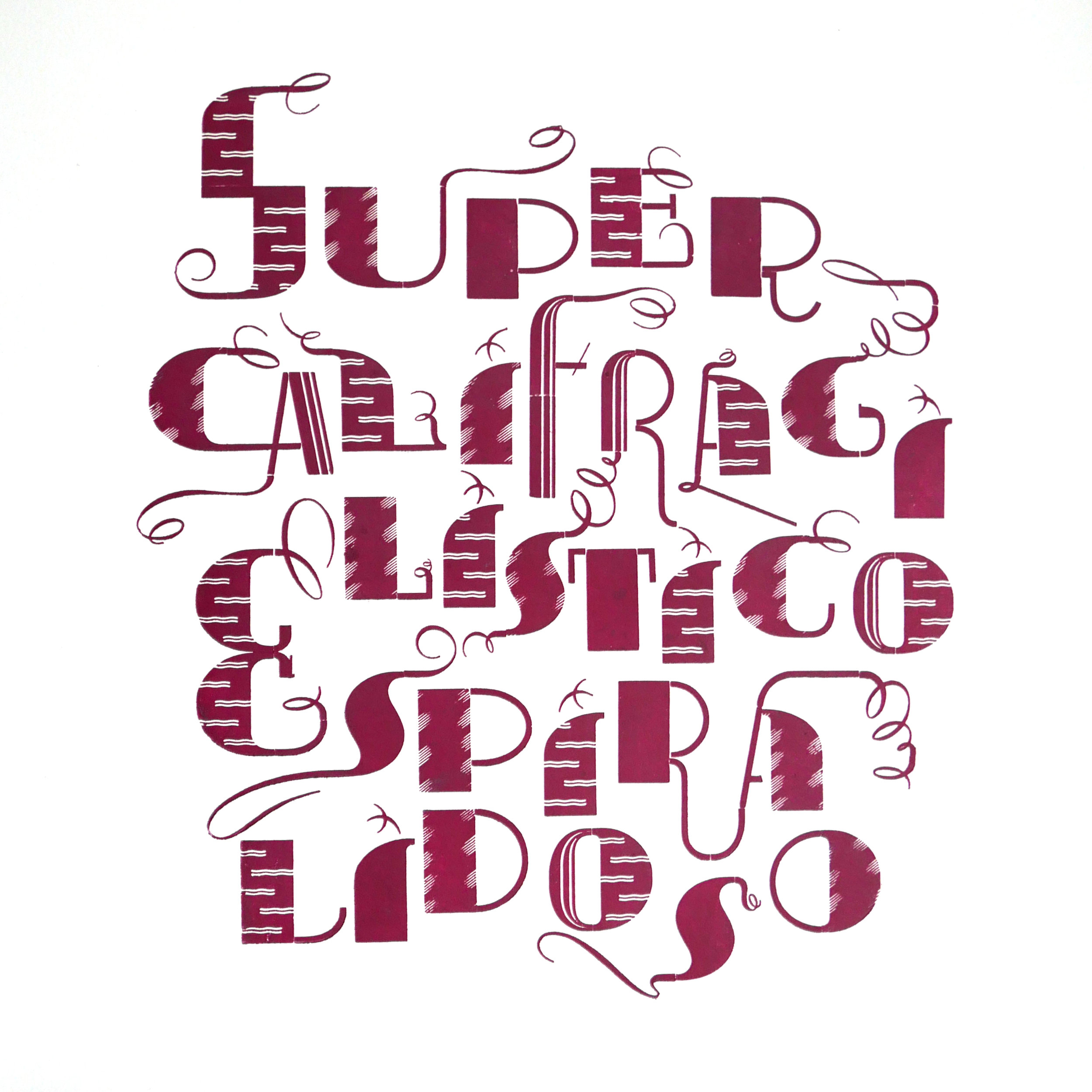
Recently, you posted an image of Super Tipo Veloz on Instagram. I am so jealous! Super Tipo Veloz was a huge inspiration for me when making LetterMaker.
Tell me about working with Super Tipo Veloz. What challenges did it present? What joys?
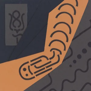
Super Tipo Veloz is a brilliant invention. I think that the type is very intelligent, and moreover, beautiful. It mixes logical, module construction with expressive calligraphy. It was typography created in an era of scarcity of typographic material in Spain after the Civil War. It allowed printers to create typographic illustrations without having to make an engraving or drawing. But it’s name is deceiving. It’s not super fast (Super Veloz), to work with it is very, very slow. Its composition is complicated by the large number of spaces it needs to adjust. See Roberto's lock-up on press here.
Still, we’ve managed to do several things and the result is spectacular, fun and cool.
Recientemente, publicaste una imagen del Super Tipp Veloz en Instagram. Estoy muy celoso Super rápido tipo fue una gran inspiración para mí al crear LetterMaker.
Háblame sobre trabajando con Super Tipo Veloz. Que desafíos presenta? Que alegrias?
El Super Tipo Veloz es un invento genial. Me parece una tipografía muy inteligente, además de bella. Mezcla la racionalidad de la construcción modular con la expresividad caligráfica. Se trataba de una tipografía creada en una época de escasez de material tipográfico en España después de la Guerra Civil. Permitía a los impresores crear ilustraciones tipográficas sin necesidad de hacer un grabado o un dibujo. Pero su nombre engaña. No es Super Veloz, trabajar con ella es muy, muy lento. Su composición es complicada por la gran cantidad de espacios que necesita para ajustar. Puedes ver el "lock-up" de Roberto aquí.
Aún así hemos conseguido hacer varias cosas y el resultado es espectacular, divertido y fresco.

"[Super Veloz] allowed printers to create typographic illustrations without having to make an engraving or drawing. But, its name is deceiving. It's not super fast to work with, it is very,
very slow."
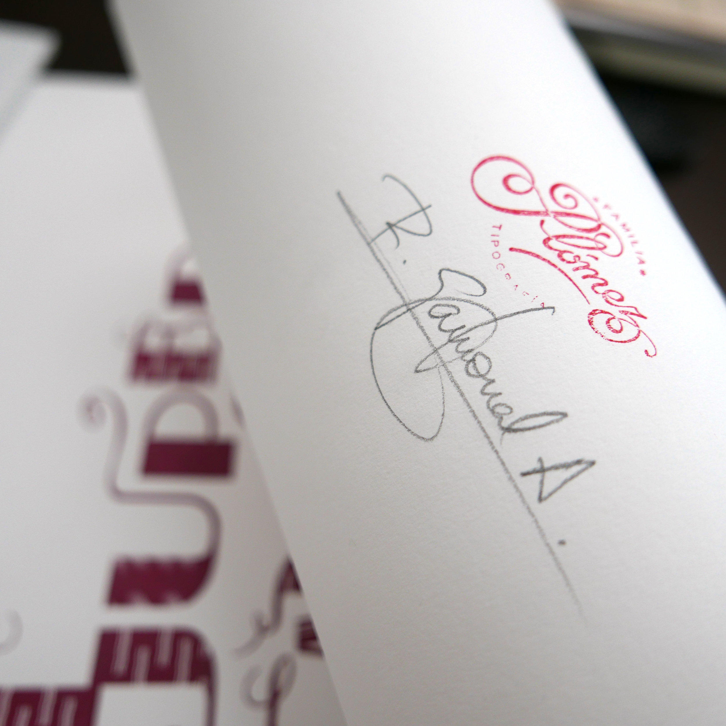
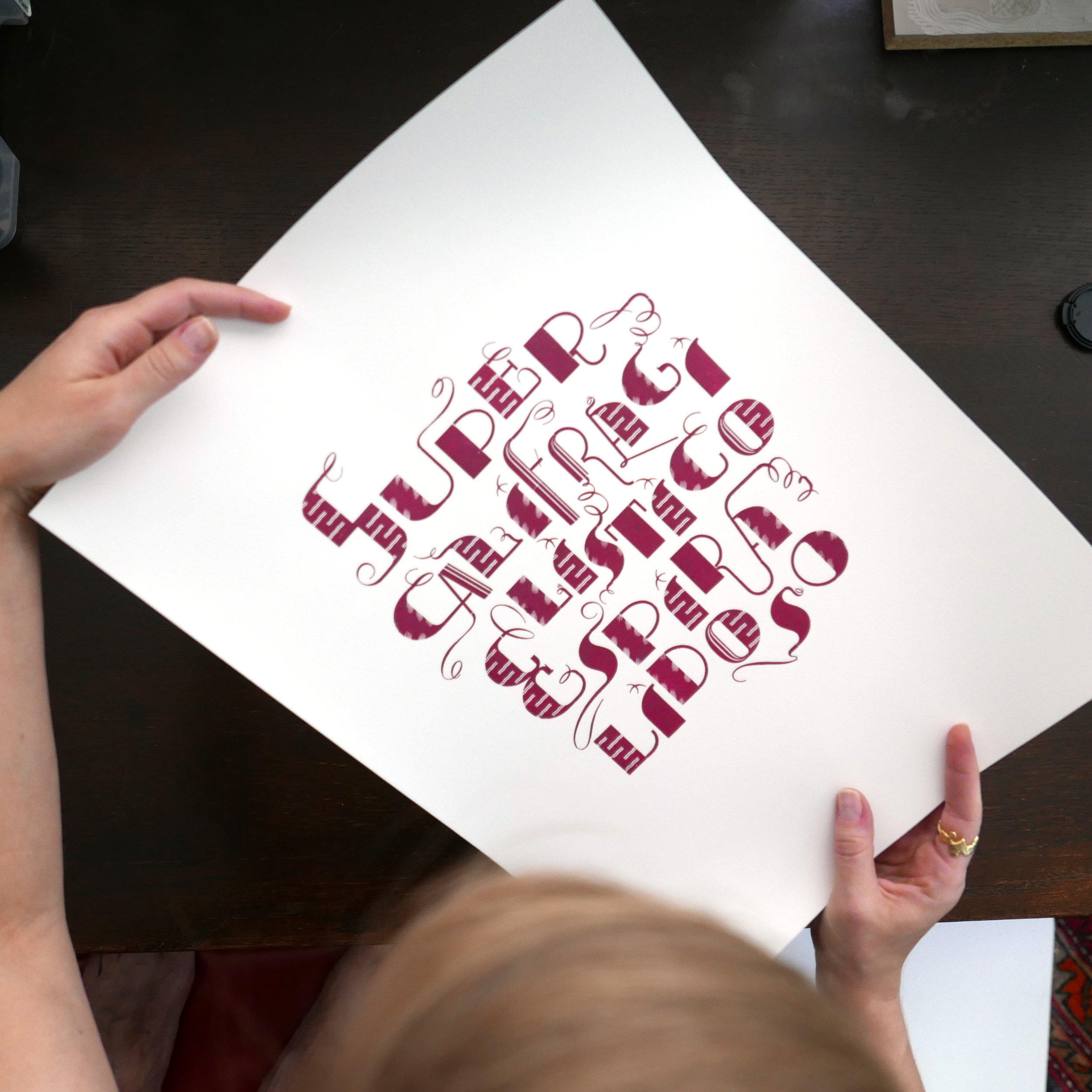
To my surprise, I received one of Roberto’s Super Tipo Veloz posters in the mail. The typography is set with immense skill and the impression is perfect. Bravo!
Finalmente, cual es tu letra favorita? Porque?
Me gusta mucho la letra "R" y en cuanto a tipografías, me sorprendo con las más clásicas como Garamond o Bodoni. Me imagino las limitaciones de la época en las que fueron creadas y me resulta asombroso que se hayan creado letras tan perfectas. Para mí, las mayúsculas de la letra Futura son lo más cercano a la perfección.
And finally, what is your favorite letter? Why?
I really like the letter “R” and in terms of typography, I am surprised by many more classics like Garamond or Bodoni. I imagine the limitations of the time when it was created and I find it astonishing that such perfect letters have been created. For me, the capital letters of Futura are the closest to perfection.
To see more of Roberto's work, visit:
Puedes ver más del trabajo tipográfico de Roberto, visita:
http://familiaplomez.bigcartel.com/artist/roberto-gamonal
Translated from the Spanish by Kelcey Towell, with help from Elizabeth Ruvalcaba.